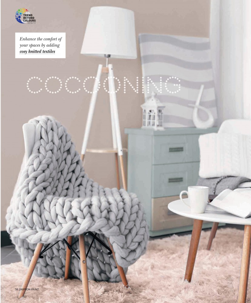
Colour speaks louder than words. It is a powerful tool that possesses the ability to influence moods and emotions.An action as simple and cost-effective as adding a new hue to a wall can do wonders for the ambience of any interior.
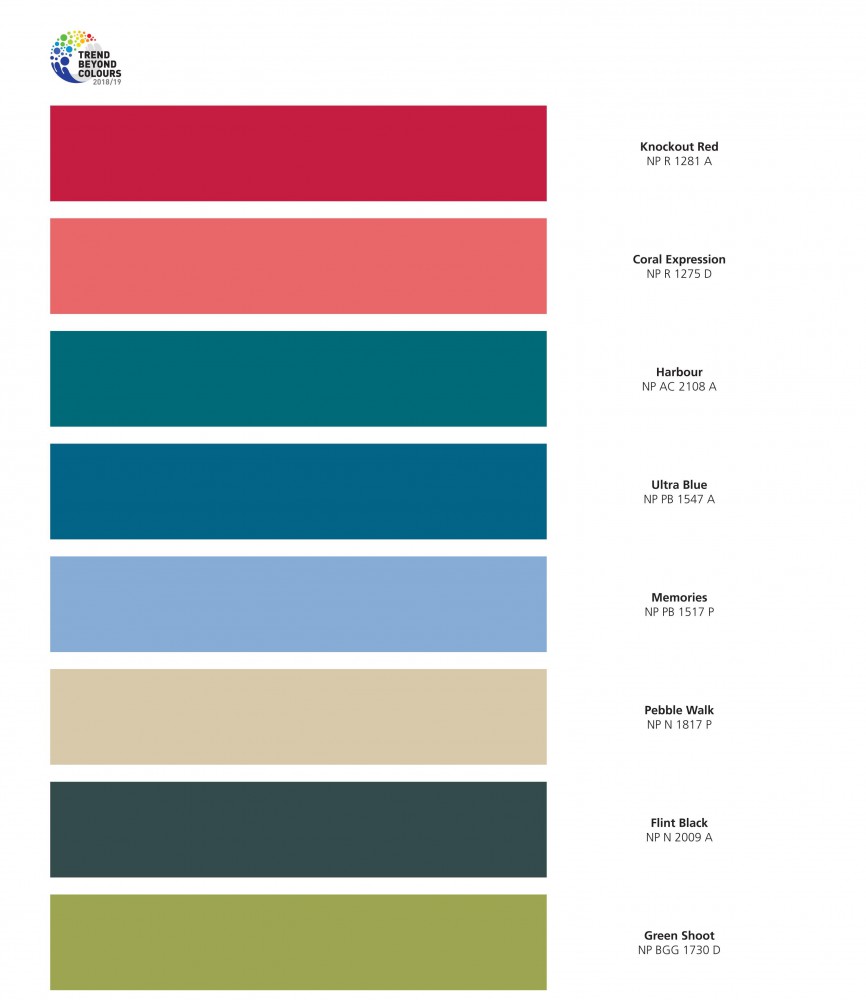
This year, Nippon Paint announced Trends Beyond Colours 2018/19 Collection — a series of market-leading colours defined by industry professionals across 11 Asian countries, for you to set the tone in 2018.
Each theme evokes a specific mood and highlights social focuses in the New Year —
Seeking Adventure to explore the fearless and bold nature; Conscious Being discusses the relationship between human and technology; Transient Glow is a dreamy cosmo inspired by water and glass; Essential Balance calls for a subtle and restful quality living.
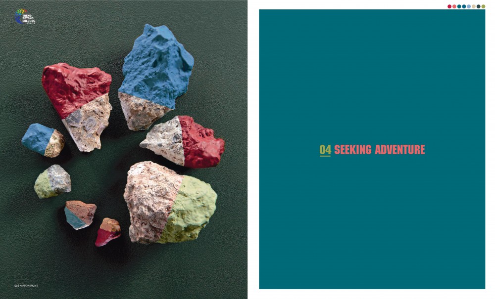
SEEKING ADVENTURE
_FEARLESS NATURE
From the highest mountain to the deepest ocean, life is a journey of exploring the unknown.
Seeking Adventure colour set is inspired by the oceans and mountains – seaweed, coral, graphite, pebble – echoing Nature’s bold and courageous personality through the use of the saturated nature tones and organic neutrals.
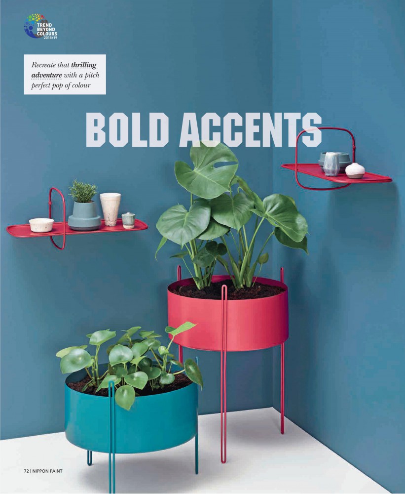
This palette encourages the clashing of colours, textures and patterns. You can combine two or more contrasting colours to create a bold and dynamic statement – red and aqua, green and coral; or add a little saturated nature tones onto the muted or mineral shades, lending a subtle yet pleasant accent.
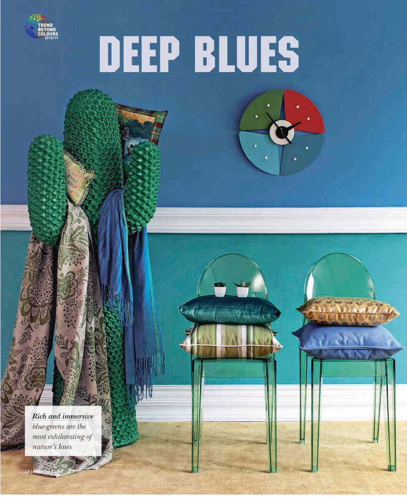
Blue-Greens is the highlight of this colour palette. Rich and immersive, it is the most exhilarating of nature’s hues. It reflects the unexplored depths of the sea or the moment when warm morning sunlight permeates foggy forest. This hue is one that brings the nature indoors.
TRANSIENT GLOW
_WEIGHTLESS DREAM
Inspired by water and glass, Transient Glow imitates the layers of transparency and light refraction from water and glass to create a sense of mysterious and dreamy atmosphere.
Pastel colours are the all-time favourite for its sweet and soft nature. Transient Glow colour set is based on a range of pastel purple and pink hues, hence bring out a sophisticated yet optimistic ambience.
Every cloud has a silver lining, imagine the peaceful and dreamlike moment before sunrise: with clouds turning from purple to pink, and sky gradually changes from dark to bright, gently leading to hopes. This composition of pastels blends well in the contemporary home, or accent the minimalist space without chaos. We particularly recommended applying it in the baby room, giving a sense of calm and serene for the little loved one.
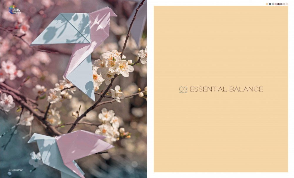
ESSENTIAL BALANCE
_SOOTHING NATURE
The modern-day bustling city needs a balance with natural harmony – a breathing space where you feel relaxed and at ease, enabling you to live at a comfortable pace.
Referencing nature, the Essential Balance connects the raw organic world to urban living.
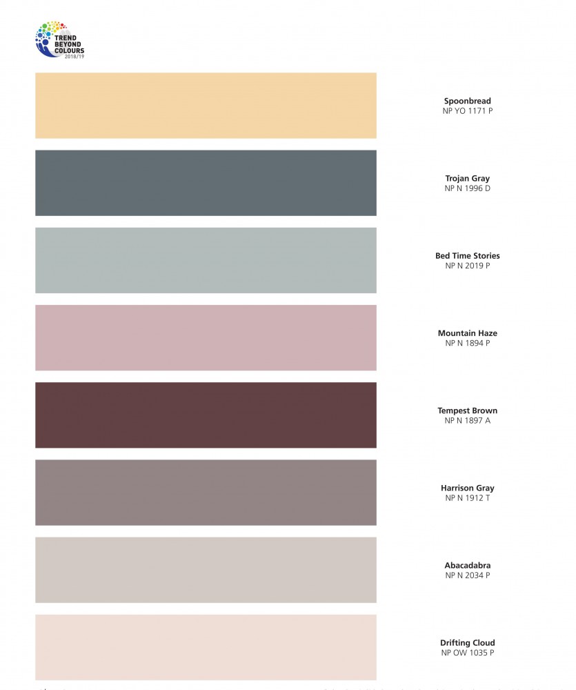
Grey and earth shade always a safe-play in the interior design world. Since the soft tones conjure a feeling of comfort and calm, with timeless elegance. You can consider integrating it in private area such as bedroom to bring a sense of restful security. Or paint it in a living room, invite a touch of slow and peaceful atmosphere – unhurried and relaxed – hence promotes a quality bonding time with family.
Like what you see? Just walk in SGB Hardware@PJ, we have almost every colour in your mind.